How we came up with the Clay Active 'shapes' logo
Share
In our design brief for a Clay Active logo we had words like simple, fun, sporty, playful and iconic.
We wanted it to look cool on sportswear or activewear. We wanted it to be easily recognisable at a glance.
And of course we wanted it to represent our brand philosophy of 'shape yourself like clay'.
The very first few designs were very literal on the 'clay'. They were kind of variations of shaping things with hands and the negative space would form the silhouette of a sporty figure.

Our next designs were much more simpler and closer to our brief. This one is recognisable, stands out and has an iconic feel:

It also carries our theme of shaping yourself into something: from a shapeless circle to an angular square.
This soon evolved into our final 'shapes' logo which ties in to our shape yourself philosophy in many ways.

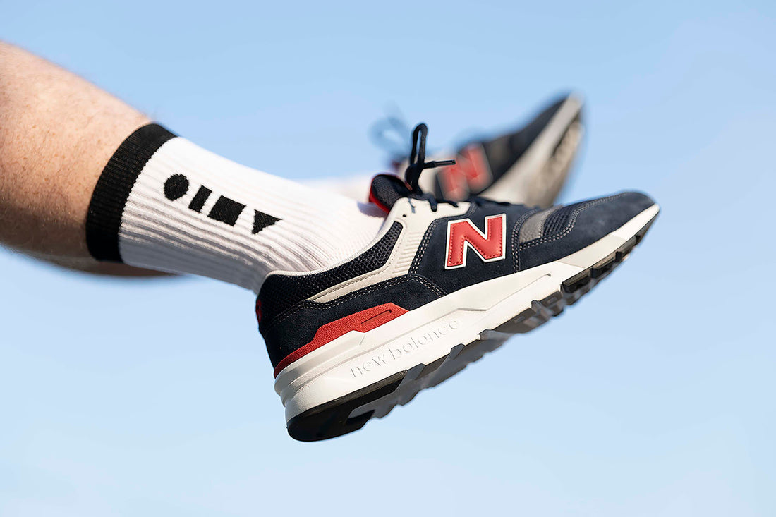
This turned out perfect because we love the look. We love how it looks on our Clay Active sport socks.
And beneath the surface, the four most basic shapes represent playfulness, difference and fun. The shapes represent our mission to encourage everyone to shape themselves, whatever they're trying to become and whatever their body shape.
It also mimics the outline of the word 'clay'. That ties it in perfectly with our philosophy to 'shape yourself like clay'.
Clay Active has been working on brining out a range of training jumpers. These are original designs, purpose-made for exercising in year-round.
These will be available in the next 1-2 months and will mark Clay Active's entry into activewear and sports apparel.
Look out Nike and the big dogs.
